How to choose a colour scheme for your scientific poster
By Dr. Tullio Rossi, Science communicator and Director of Animate Your Science. Follow Dr Rossi @Tullio_Rossi & @Animate_Science. This post originally appeared on the Animate Your Science Blog as: How to Select a Great Colour Scheme for Your Scientific Poster
TLDR
Don’t use the default colours in your design software.
Do use the eye-dropper tool to sample the great colour palettes you can find online.
Do use 3 to 5 colours and apply them to everything in your poster, figures included.
Making an effective scientific poster is about standing out from the crowd and presenting your hard work in the best light.
But choosing a cohesive, eye-catching and stylish colour scheme is easier said than done. With no help from your design software’s default colour palette, and infinite colours to choose from, it can be overwhelming. We’re here to make it as easy for you as a paint-by-numbers art kit!
The problem
How many academic posters have you seen that look like this?
The answer: too many.
That’s too many scorched retinas and too many missed opportunities for great conversations. Instead of attracting potential collaborators or funders, it’s only successful at repelling meaningful connections.
So what’s the cause of these horrendous colour schemes?
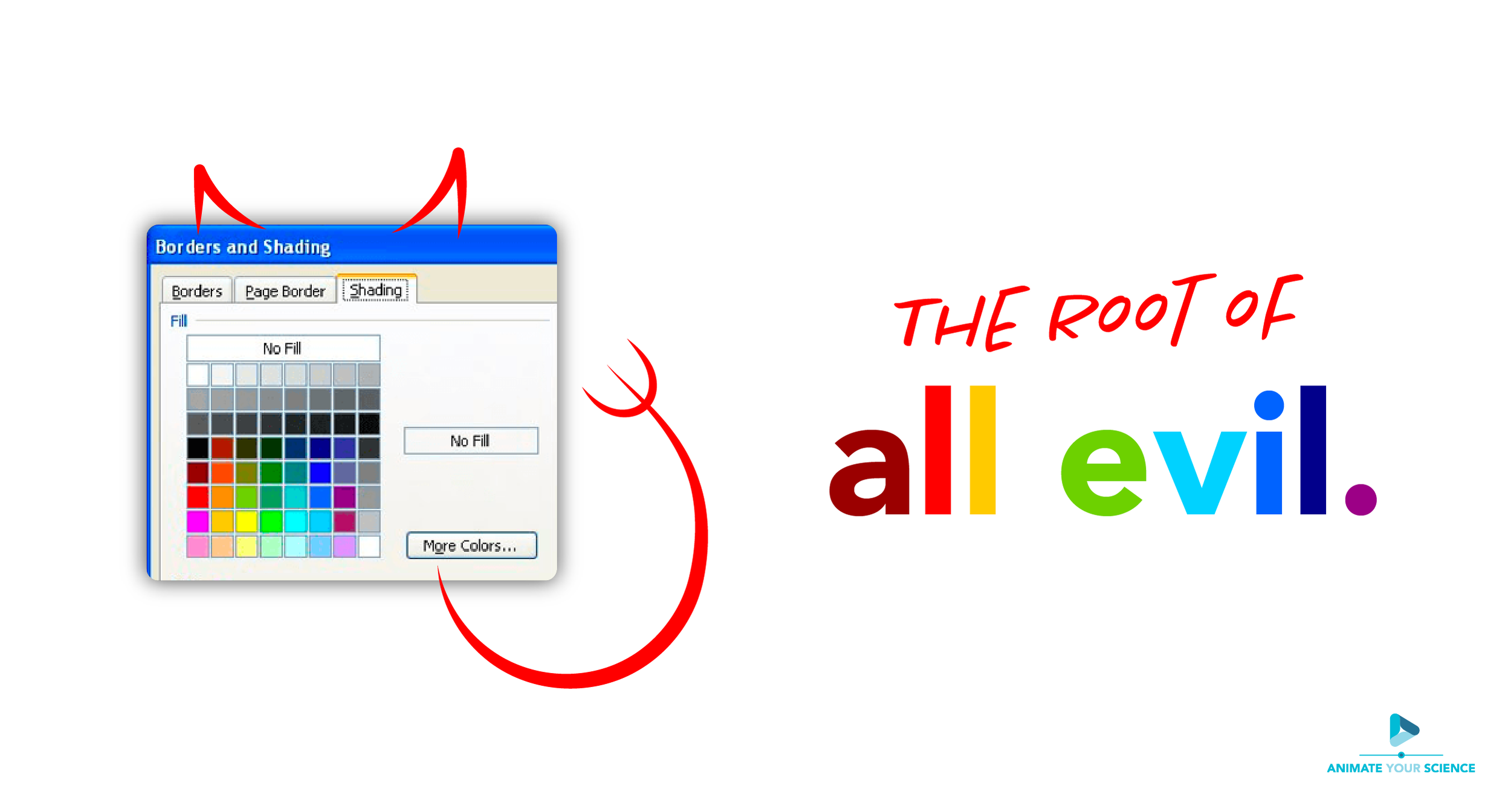
The root of all evil
Due to his brilliant work eradicating polio, I can probably forgive Bill Gates. But his behemoth software company, Microsoft, is single-handedly responsible for the ocean of scientific posters with diabolical colour schemes.
However, it’s not the researchers’ fault. Surely if Microsoft is recommending these colours, then they must be ok?
Nope. Just nope.
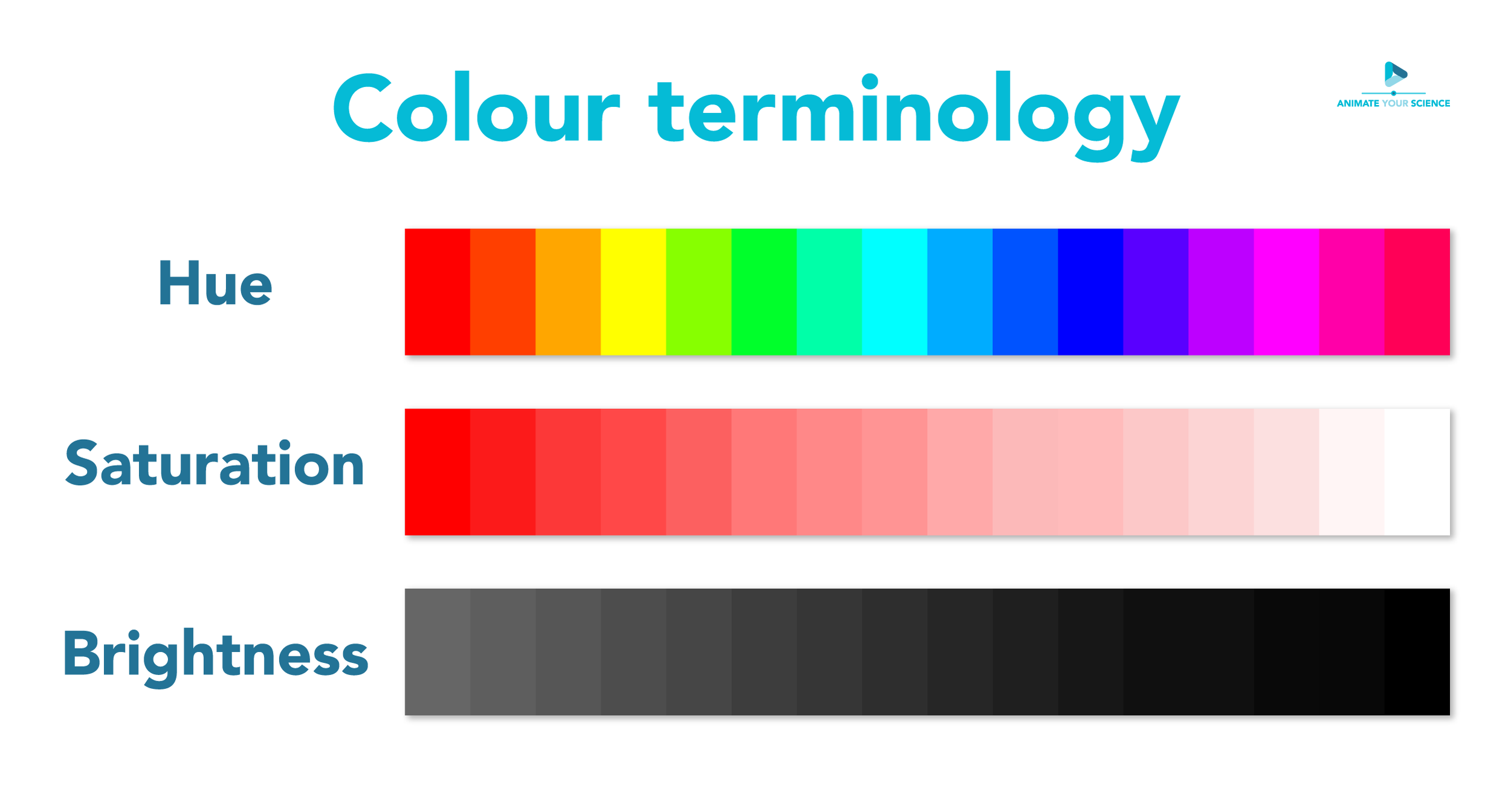
There are several problems with the ‘standard’ colours. Firstly, they’re way too saturated, so they’re very ‘bright’ - this contributes to that burn-your-retina quality. Secondly, they just don’t work together. There are good reasons why some colours do or do not work with others. We’ll get into this colour theory later in the blog.
For now, the point is that the ‘standard’ colours are just not useful - so forget they exist
How many colours?
Before we get into choosing specific colours, let’s go over the correct number of colours to use in one poster.
A good rule of thumb is to use 3 to 5 colours.
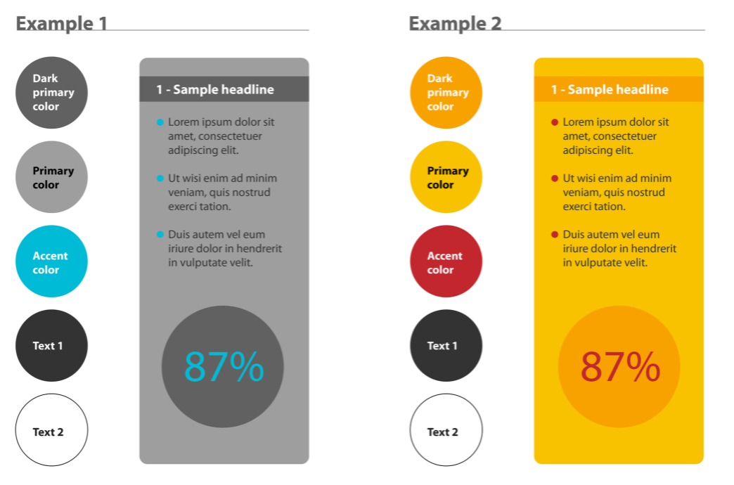
In general. you’ll have a primary colour, a secondary colour, and an accent colour. As you can see in the image below, an accent colour is to be used sparingly, and its job is to stand out from the other colours and attract attention. It’s great for highlighting key things or making your headers stand out.
How to find a cohesive colour palette
Manually choosing colours that work well together is tough. There is an infinite number of colours with different shades and tones to choose from. But that’s ok, I have a really handy trick for you.
The eye-dropper tool is your new best friend. It lives inside all design software (even Microsoft products) and its job is to sample colours from other images or text.
In your design software, you’ll need 1) a thing you want to colour (e.g. text or an icon), and 2) a picture whose colour you’d like to steal (I mean ‘borrow’).
Select your text or icon, select the eye-dropper tool (in Microsoft it’s usually in ‘more colours’) and sample the colour from your image. Easy!
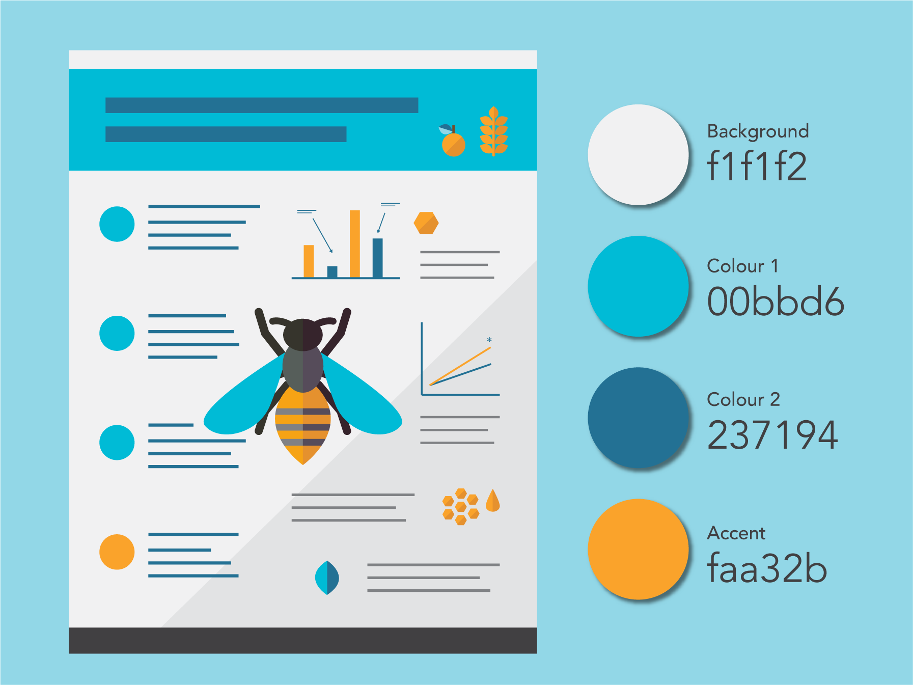
What’s great is that you can use this technique to ‘borrow’ the thousands of professionally-curated colour palettes on the web. Using Google Images or Pinterest, find a colour palette you like and get ‘borrowing’.
Pro tip: We always recommend including one eye-catching image on your poster. Often, this is the hardest thing to do when making a poster. It requires creative design skills or some savvy web searching skills. Either way, once you have an eye-catching image, it’s a great idea to sample the colours in the image and use them as your palette for the rest of the poster.
A cool resource to check out is Material Palette. Simply pick 2 colours that you like and it’ll give you a recommendation on how to put them to use on your poster. Then, download the palette and use the eye-dropper tool to sample the colours.
Finally, you may be stuck with the dreaded institutional poster template. Try your hardest to free yourself from its crushing vice-like grip. But, if you’re forced to use it under penalty of exile, the worst thing you can do is to fight it and choose clashing colours. So embrace it. To do this, sample its colours and use them throughout your poster design.
Freestyle colouring
If you’re feeling creative and would like to get your hands dirty, you can go freestyle and pick your own colours. With so many to choose from, you’re going to need to follow some basic principles.
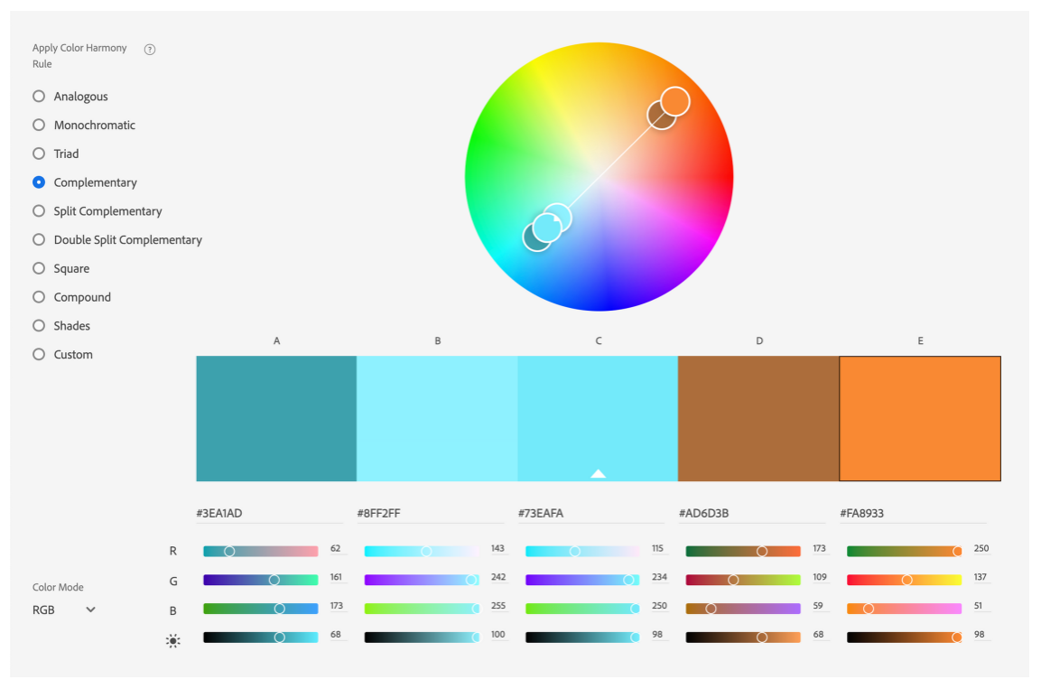
Take a look at the Adobe Color Wheel. In short, each colour on the wheel has a relationship with one or several other colours. On the left, you can choose the type of relationship, and then experiment with the colours - either on the wheel directly, or using the sliders below. A good one to start with is the ‘complementary’ relationship - it uses 2 colours on opposite sides of the wheel, which always work well together.
RGB or CMYK?
If you designed your poster with professional software, you’ll have the ability to control the colour profile or colour mode. Nothing complicated, there are two options: RGB and CMYK. The first one is for digital use, and the second one is for printing - it’s as simple as that. So if you’re submitting your poster online to the conference, use RGB. But for your file that you’ll send to the printer, use CMYK.
Graphs and figures
Like your text and images, you should also apply your colour scheme to your figures. If this is difficult to do (perhaps you didn’t produce them yourself), I recommend making a simplified version of your data in your design software. After all, your poster is about starting a great conversation, that’s it. If the viewer is interested in your high-fidelity figures, you can supply them later - a great way to establish a connection beyond your poster session.
That’s a lot of info dedicated to colouring your scientific poster, so thanks for hanging in there with me.
But, we’ve only just scratched the surface on what makes a great scientific poster.
To properly cover this topic, we’ve developed a whole online course: How to Design an Award-Winning Scientific Poster. You can learn at your own pace and arm yourself with the tools, templates, skills and knowledge to create your own award-winning scientific posters. We’ve had excellent feedback on the 33 video lessons, 3 hours of learning and 8 templates & downloads included - so we’re confident that you’ll love it too.
Take-Away Points
Don’t use the default colours in your design software.
Do use the eye-dropper tool to sample the great colour palettes you can find online.
Do use 3 to 5 colours and apply them to everything in your poster, figures included.

