Causal Maps for Data Analysis
By Steve Powell - Causal Map Ltd,
Fiona Remnant - Bath Social and Development Research,
and Hannah Mishan - Causal Map Ltd & Bath Social and Development Research
Causal Map is a web app dedicated to causal qualitative data analysis. There are many other qualitative digital analysis (QDA) tools out there such as Quirkos, Nvivo and Dedoose that allow you to code individual themes. However, Causal Map app is natively causal: you don’t add connections to your coding, the connections are your coding. As you code, live causal maps display the stories you have discovered.
We (Steve, Fiona, James) set up Causal Map in response to the need of Bath Social Development and Research and many other researchers struggling with how to effectively code and analyse causal claims from narrative interviews. Originally, most of our users were in international development but we knew there were people outside that field who could benefit from our approach to causal mapping. After all, nearly everyone undertaking social research or creating policy needs to know about people’s mental models of the world: what they think causes what.
We read about the Sage concept grants online and thought they were a great fit, and were thrilled when we won: an opportunity to reach out to academics and students, as well as scaling our app for a bigger audience. We were able to do that through a video presentation hosted by Sage.
Over the last year, we’ve learned that the best way of promoting the software in academia is by engaging individual researchers and helping them discover what Causal Map can do for them — rather than trying to make a pitch at departmental level.
We’ve also learned that the personal touch is most important. We have learned a lot by listening to our uses and have continuously shaped the software to adapt to their needs. Now, when people ask “can you do X in Causal Map?” the answer is mostly “Yes!”.
How does Causal Map work?
One way to find that out “what people think causes what” is to ask them, and analyse their answers. To analyse and visualise this data clearly you can create causal maps, a directed graph showing causal relationships. Often, the causal connections in a causal map will be based on information from more than one source. These maps help researchers better understand and present the different factors affecting people’s lives.
Links are scaled and labelled to reflect the number of sources that made each link.
The Causal Map app was created to allow researchers to code, organise, understand, analyse and present this kind of information using just one app.
Something that has always been key to the Causal Map app is keeping respondents’ voices at the forefront of the coding and analysis process, a value shared with many social science researchers. The original quote on which each causal link is based is stored within the link itself and appears when you hover you mouse over it in the interactive view. That means that at every stage of causal mapping, it is possible to directly return to the original story, in the original context.
Allowing analysts and their audience to refer back to the original data and understand why it was coded in the way it was is crucial to being transparent, rigorous and systematic about the coding process.
A Challenge
One challenge some of our users spotted was the ‘transitivity trap’; because of the way that links can be aggregated it is possible to draw incorrect conclusions by conflating two distinct stories.
The orange box contains the origin factor and the purple is the target factor, the links in between show the path between the two. Links are labelled with the total number of sources that mentioned each link.
Path tracing is a useful filter in the Causal Map app that allows users to trace the number of paths from one factor to another. This helps you understand the links between the two factors and how they can be related, for example the above map helps us understand how government subsidy could lead to investment in crop storage. This can help analysts better comprehend how and when respondents are experiencing change.
Tracing whole paths like this can be appropriate for some projects, such as those looking at value chains where you would expect different stakeholders to discuss different links in the chain.
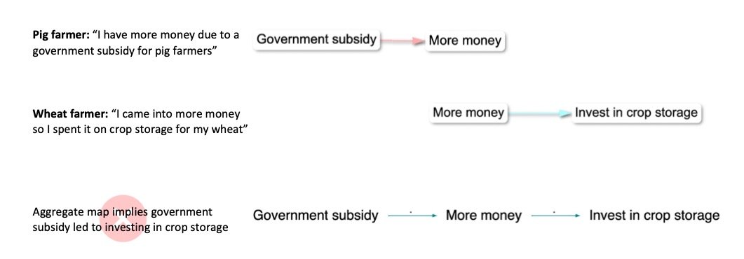
However, this can lead careless analysts to fall into the "transitivity trap”. For example in the above map, the 11 sources that claimed the Government subsidy led to "more money” may be a totally different group of respondents to those that mentioned the second link from "more money” to "invest in crop storage”.
The illustration below should make this clearer: the aggregate map could be misleading.
The solution to this issue came in the form of a filter. Causal Map has dozens of filters (which can be applied individually or in chains), and this one we call “tracing threads”. It is a specialised version of the “tracing paths” filter applied in the previous map. When you use the trace threads filter you can follow the individual threads of influence across your map as reported by each individual source, giving a more conservative representation of a factor’s influence. In the below map the number of people who actually mentioned links all the way from "government subsidies” to "investing in crop storage” is a lot clearer. You can see the overall number of people mentioning paths all the way from "subsidies” to "investing in crop storage” was 9, not 12 as the previous map could have implied. Also only 2 sources had a thread all the way from "invested in new business” to "more money”, to "investment in crop storage”. Without using thread tracing, analysts may risk overemphasising the evidence for certain causal links and paths.
Thread tracing map, tracing downstream threads from Government subsidy.
This is the exciting thing about the Causal Map app: it is continuously evolving and improving.
What is coming up
Alongside improving the Causal Map app we have been working hard on a new way to collect your data, an online survey tool called StorySurvey. This tool uses AI to conduct engaging and interactive online interviews at scale. It is specialised in collecting causal narratives so that causal maps can be created live from the interview data.
How to get involved
Anyone can try Causal Map for free, for an unlimited period. Users can view and analyse any map shared with them, and also create and code their own map, but they can only create up to 50 links — enough for small files or to have a play around. So have a look at our Causal Map app site (https://www.causalmap.app/) to find out how it can benefit your research or jump right in to the app itself.
Our Guide tells you more about our approach to causal mapping, or you can watch an introductory video or sign up to our mailing list.
Have an idea? Apply for a Sage Concept Grant!
Sage’s Concept Grant program has been running since 2018 and aims to fund innovative software solutions that support research in the social sciences. We are seeking proposals for new technological solutions that support the adoption, development and application of established and emerging research methods, including quantitative, qualitative, mixed, and computational methods. We offer seed £2k grants to develop ideas and £15k grants for scaling prototypes. Explore previous winners. Apply for this year’s round and find out more here. Applications are open to anyone regardless of location or affiliation until 20th of June.










Looking back at 2023, find all posts here!
We explored stages of a research project, from concept to publication. In each quarter we focused on one part of the process. In this recap for the year you will find original guest posts, interviews, curated collections of open-access resources, recordings from webinars or roundtable discussions, and instructional resources.